In Backlight, when you use one (or both) of the side pallets in your layout, the content you place there will appear in the desktop layout to the left or right of the main content, depending on the layout you choose. When your site is viewed on mobile devices, however, that content is not visible unless your viewer clicks on the mobile menu icon, which opens the pallet.
And the pallet is also where your mobile menu resides. (If using a three-column layout, you’ll have two pallets, one of which will house the mobile menu.)
When the pallet containing the mobile menu is opened on a mobile device, the navigation menu is at the top (unless you also have a masthead in the pallet) and any content you added to the pallet will be stuffed below the menu.
If your menu is short, this typically isn’t an issue as your viewer will likely also be able to see the pallet content at the same time.
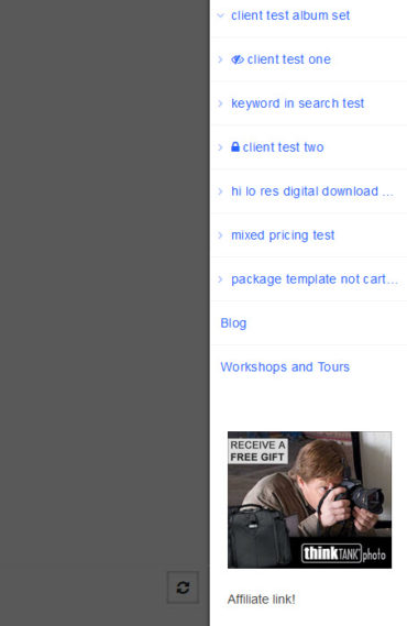
However, if you have a lot of albums and album sets, your viewer will need to scroll down and down to finally get to that content. Of course, viewers of the mobile site may not even realize that content exists because they’ll just scroll down the menu until they find the menu item they want.
But what if it’s important to you that your viewers see that pallet content? Maybe it’s an affiliate ad you want them to see. Maybe it contains important information.
One solution is to use a navigation menu that doesn’t have many items so that scrolling down to your pallet content isn’t an issue.
One way to do this is to change your Menu Set so that there are no sub menus. This may or may not be a possibility for your site.
Another option is to use custom css to limit the sub-menu items on the mobile menu. I show how to do that in this post.
Pallet content above the menu
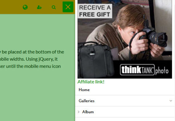
Yet another option is to place your important pallet content above the navigation menu so that when your viewers tap on the mobile menu icon, what they see at the top is your content with the navigation below that content.
You can do this with just a little bit of jQuery. You may also need to add some custom css to style things to your liking.
This is a little involved and there are some variations that I’ll address, which makes this seem more complicated than it really needs to be.
And this may not be the most elegant way of approaching this.
(Note: I’m no expert in jQuery. I’ve used it a little bit and can muck my way around some simple things. If you need to know more, I’d suggest getting a book or take one of the many online courses that are out there.)
Much, if not all, of your pallet content will need to be written in html. No getting around that. You’ll see why in a bit.
What we’re going to do is put the pallet content that needs to be moved inside of a div that uses a custom class. For this purpose, I’m creating a custom class named “mobile-pallet-top” and assigning it to the div that contains the pallet content that I wish to be placed at the top of the mobile menu. For example:
<div class="mobile-pallet-top">….your pallet content….</div>
What this content will be is up to you. If it’s just text, maybe with a heading, that’s pretty straightforward. If you’re placing an affiliate ad, then place the html code that your affiliate company has given you inside the div.
If you want this same content to appear in the pallet throughout the site, then phplugins would be the way to go. Use the pallet01_top or pallet02_top hook, depending on where you’re placing your mobile navigation. These hooks will insert your code into the content area of the pallet. I’ll cover that near the end of this post.
Content in copy areas
If not using phplugins to place your content, or you want to individualize albums, sets or pages, then place it in the pallet copy areas. If it’s going in a page, then add it in the Page Copy areas in Backlight (in the Page Designer).
If this is going in an individual album or set, then you can add it to the Album/Set Copy area in Lightroom (if using Lightroom to publish your albums) or in the pallet copy area in the album/set in Backlight.
If you want this to appear in all albums or sets, then place the html code in the pallet copy area in your album or album set template.
With the content placed in the pallet, now we need to add some code that will move it to above the mobile navigation when viewed on mobile devices or narrow browser windows.
We’ll do this using jQuery via phplugins and the scripts hook. If you’re not familiar with phplugins or how to enable this feature, see the TTG documentation.
Here’s the basic code for using the scripts hook in phplugins:
function scripts() {
	echo '
        <script>
       …your scripts…
        </script>
   ';
}
Any scripts you use will replace “…..your scripts…..”
And here’s the basic jQuery that will move your content to above the vertical mobile navigation menu:
<script>
$(".mobile-pallet-top").insertBefore($("#page__pallet__T1 nav.nav.nav_v .primary-menu"));
</script>
What this does is look for an element that has the class “mobile-pallet-top” and inserts it before an element that has the class of “primary-menu” and is also inside the nav element that has the classes “nav” and “nav_v”.
But there’s a problem with using this code alone. The code will always move the content. This means that if your site is using horizontal navigation the content is moved into an element (the vertical navigation) that is not being displayed at desktop widths. So we need to tell it to move the content only when the width of the browser or device triggers the site into its mobile configuration.
Below is the code that will do that:
<script>
$(window).resize(function(){
//set width below to your mobile breakpoint
if($(window).width() <= 992) {
	$(".mobile-pallet-top").insertBefore($("#page__pallet__T1 nav.nav.nav_v .primary-menu"));
}
});
</script>
This will move the content if the browser width is 992 px or less. Set it to whatever breakpoint you’ve set in your page template layout.
One issue with this is if you’re viewing on a desktop browser. If you view your site at full width on your monitor, you’ll see the pallet content. Yay! If you reduce the browser width so that the site drops into its mobile configuration and then click on the mobile menu, you’ll see your content above the navigation menu. Yay again!
But if you expand the browser width back so that the site reverts to the desktop layout, the pallet content is no longer there. Boo! That’s because the move to the vertical menu was triggered when the browser went to mobile size. And at desktop size, the vertical menu is hidden and so is your content.
Refresh the page and the content will return.
If you don’t anticipate your viewers resizing their browsers when visiting your site, this is not an issue. But if you want to cover all bases, there’s a solution for this (which, as mentioned above, may not be the most elegant but it’s what I came up with).
The solution is to place the content twice in the content area. One instance will always be there for the desktop version while the second one is meant for the mobile pallet and is hidden from the desktop version. Then in the jQuery, add a line that reverses that hiding of the content meant for the mobile menu.
In the page/album/template content area (or the content you’ll add to phplugins) double up on the content. In the second version, add the class that will be used to move the content and add inline css that will hide the content on the desktop. That’s the style=”display:none;” bit you see below. Here’s what it will look like all put together, using some dummied up affiliate ad html:
<div class="desktop-pallet-top"><a href="https://affiliate-url.com"><img style="width: 100%;" src="https://affiliate-url/images/ad-image.jpg" alt="alternate text" /></a></div>
<div class="mobile-pallet-top" style="display: none;"><a href="https://affiliate-url.com"><img style="width: 100%;" src="https://affiliate-url/images/ad-image.jpg" alt="alternate text" /></a></div>
Notice that I added a class to the first div to indicate that it belongs in the desktop version (class=”desktop-pallet-top”). Because this version will appear below the mobile menu, we’ll target that class with custom css to hide it in the mobile menu. (see below)
Now we’ll update the phplugins code, adding to the jQuery a line that will undo the hiding of the div that contains the content destined for the mobile display. This is the final version for the script section of the phplugins:
function scripts() {
 echo '
<script>
$(window).resize(function(){
if($(window).width() <= 992) {
	$(".mobile-pallet-top").insertBefore($("#page__pallet__T1 nav.nav.nav_v .primary-menu"));
	$(".mobile-pallet-top").css("display", "block");
}
});
</script>
';
}
Adding the pallet content via phplugins
Above I mentioned using phplugins to add the content to the pallet in all pages on your site. Below is the function that will do that. I’m going to assume that the content is going in Pallet 1, so change as necessary. I’m also assuming that the entire site is using the same page template for all pages and album/album set templates.
The return false; statement used at the end of the function pertains to content entered in the pallet content area (in Backlight or Lightroom). It will make it so that any content added there is not displayed. If you have content you want to add to individual pages, albums or sets, then change that line to return true;. (All additional content added in the pallet area in Backlight or Lightroom will appear below the mobile menu.)
Here is the phplugins code to add your content to the pallet area for all pages:
function pallet01_top() {
echo'
<div class="desktop-pallet-top">a href="https://affiliate-url.com" target="_blank"><img style="width: 100%;" src="https://affiliate-url/images/ad-image.jpg" alt="alternate text" /></div>
<div class="mobile-pallet-top" style="padding: 0 8px; display: none;"><a href="https://affiliate-url.com" target="_blank" rel="noopener noreferrer"><img style="width: 100%;" src="https://affiliate-url/images/ad-image.jpg" alt="alternate text" /></a></div>
'; return false; }Needed CSS
Now the only thing left is to add the css so that the content meant only for the desktop pallet does not appear at the bottom of the mobile menu.
If you’ve not enabled custom css, see the TTG documentation.
Add this to your custom css file:
@media screen and (max-width: 992px) {
	.desktop-pallet-top {
		display:none;
	}
}
Set the max-width to the breakpoint you set in the Layout section of the page template.
Now just be sure you’ve activated the phplugins and custom css in your page template.