When first using any of the TTG Web Module plug-ins, it can be a little confusing as to what part of the page the various parts of the plug-ins control.
You're confronted with terms like the Block and the Grid, Page, Page Container, Footer, and more. Some of these will make sense, others won't until you start playing with the plug-ins.
All TTG Web Module plugins, with the exception of Theme for WordPress, have the exact same page layout options. Theme for WordPress is nearly identical, only missing the page settings for the Grid, as this part of the page doesn't appear in a WordPress page or post.
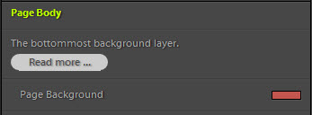
A great way to get familiar with all the different page areas is to go through the Site Info, Color Palette, and Appearance control panes and set all the background-color settings that you can find to different colors. Then look at the page and start matching colors to areas.
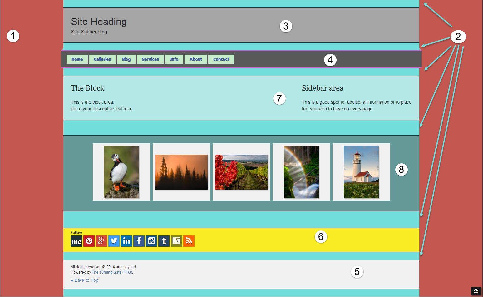
Which is exactly what I've done below. The areas follow the order presented in the TTG plug-ins, starting with the Site Info control pane and followed by Color Palette and Appearance. You can download the template for this TTG page layout here.
Except for some added top and bottom margin in some areas, this is a default page set up. Keep in mind that you can move a lot of these pieces around so your set up may differ.
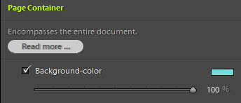
2: Page Container
The Page Container is the next layer. It contains all the page content. The rest of the sections will be within the Page Content. There are two exceptions to this: if you check the "Orphan" option on either or both the Masthead and the Navigation areas. If you do, they will no longer be inside the Page Container. This is useful if you wish to have full width header and/or navigation but want to contain the page content itself to a certain maximum width.
Note that the turquoise Page Container color occasionally appears within the page from top to bottom. This because I've added Margin to some of the rest of the page areas. When you do this, the background color of the Page Container will show through.
3: Masthead
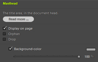
The Masthead is where you can place a logo, a text based graphic identity plate, or use a Heading and/or Sub-heading.
Notice the "Orphan" check box. This will eject the masthead from the Page Container. More on that in the TTG documentation here.
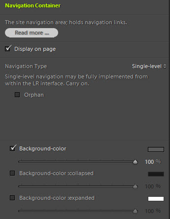
4: Navigation
The Navigation section. This can also be orphaned. See the TTG documentation here for more information.
For a full explanation of the various background color settings you see (for the mobile menu), see this TTG documentation page.
5: Footer
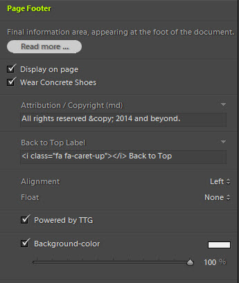
Here I've set 24px of top and bottom margin. You can see that Page Container background-color above and below the Footer.
Notice the "Wear Concrete Shoes" check box. Checking this box will push the footer to the bottom of the browser window for pages with little content.
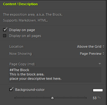
7: The Block
The Block is where you can place any descriptive text. Notice that I've set the background-color to white and the opacity slider at around 50%. This lets some of the Page Content background-color show through, making the Block background-color a light blue.
I've also placed the Block above the Grid.
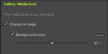
8: The Grid
In CE4 Gallery, the Grid area contains your gallery thumbnails. In CE4 Autoindex it contains the index. In CE4 Stage it contains whatever you've chosen to present: a Galleria slide show, a video, a still image, etc.
Here I've chosen a dark grey background color with opacity at around 50% This lets some of the Page Container background-color show through, making for a sort of darker bluish-grey background.
The Grid also has some top and bottom margin, which shows the Page Container background-color above and below the grid.
In CE4 Gallery, don't confuse the Gallery/Media area background-color control, which is near the bottom of the Appearance control pane, with the Thumbnail Grid's Cell Background-color found near the top of the control pane.
Try it yourself
I encourage you to try this experiment yourself. To make it a little easier, I've created a template of this TTG page layout for you to try yourself. This is a CE4 Gallery template so you'll need to own CE4 Gallery to use the template.
Download the template here: CE4-gallery-page-areas


Great Idea, Rod. I am sure I will make good use of this as I seem to have a mental block about the names of the various sections when using TTG products.
Be sure to try moving sections around too. Like placing the Masthead below the navigation, trying out the “orphan” features of Masthead and Navigation, etc.
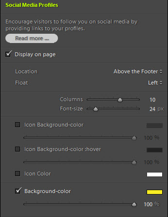
And play with where the Social Media Profiles show up. If you place them in the Masthead, either top or bottom, or the Footer, the background color disappears.
And in the Masthead, if you’re using any top or bottom margin you’ll see the icons start dropping above or below the masthead, depending on where you positioned them. So you’ll need to set 0 Margin for the masthead. Unless you like the affect.
And the “Navigation Column” area requires that you use Column Navigation.