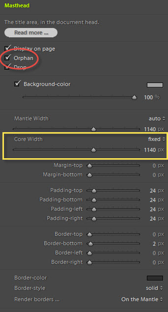
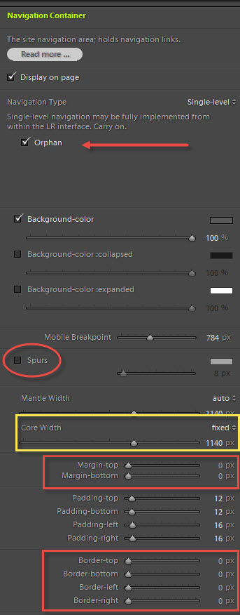
There are several options in both the Masthead and Navigation areas that might cause some confusion. Options like "orphan" and "drop."
The Social Media Profile area also has an option of placing the icons in the Masthead, either at the top or bottom and aligned to the left or right.
Let's take a look at these.
Social Media Profiles in the Masthead
The two options for placing Social Media Profile icons in the Masthead are Masthead Top and Masthead Bottom. You can also float them left or right.
When you do this, the background-color you set for the icons gets dropped and the icons are placed as-is in the "masthead" div element, positioned either at the top or bottom of the element depending on your choice.
But something interesting can happen if you have any top or bottom margin set in the Masthead. And it's easiest just to illustrate it.

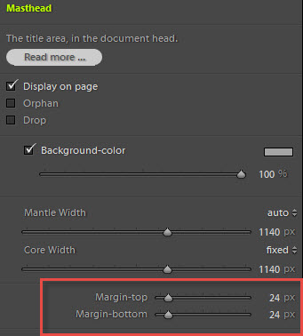
Here, the Social Media Profiles are placed in Masthead Bottom and a bottom margin of 24px is being used in the Masthead. You can see that the Social Media Profiles "drop" beneath the masthead area. In reality, they're just stuck to the bottom of the "masthead" div element.
This can be an effective design choice, but it may not be what you want or expect.
Drop that Masthead!
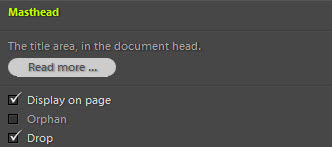
You can place the Navigation above the Masthead if you wish (just like I've done with the TTG-Tips site). This is done by "dropping" the Masthead. It's very simple to do, just check one box.
You might notice that I've also disabled the "spurs" and eliminated the borders in the navigation for this demo page. I think it just looks cleaner this way.

The "Orphan" settings
The "Orphan" settings in both the Masthead and Navigation areas will remove those areas from the Page Container. By doing this you can have those elements span the entire width of the browser while containing the rest of the page to a narrower width.
Here the Navigation is "orphaned" while the Masthead is "dropped" but not "orphaned."
Here both Navigation and the Masthead are "orphaned" and Masthead is still "dropped."

To keep the Masthead and Navigation items in line with the rest of the page while having their backgrounds span the entire width of the browser, be sure to set the Mantle to "auto" and the Core to a fixed width.
And one more variation
So what happens when you place the Social Media Profile icons in a Masthead that's been orphaned?
Below I've set the Masthead to "orphan" and the Mantle Width to auto. See what happens:

Again, this could be an interesting design choice.
Be sure to try all of the options out for yourself. There's nothing like experimenting to see all the possibilities TTG has to offer.


