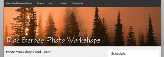
In case you’ve been wondering about how to employ dynamic mastheads in CE4 based sites, wonder no more.
First, what’s a dynamic masthead? It’s a masthead that will adjust to the size of the browser width so that it looks good no matter the device.
If you use a graphic logo for your masthead, when you shrink the browser size down or if you view your site on a smart phone, you’ll see that your beautiful logo that you spent lots of time (or lots of money) on, is now teeny, tiny version of its glorious self and any text you’ve included in the logo is so small that you have to put your iPhone under a magnifying glass.

The solution is to serve up different logos for different devices using custom css and media queries. For example, you’d send a logo with text in a larger font to mobile devices.
But Matt has already explained the entire process in great detail in his Dynamic Masthead tutorial. The tutorial at the link is for the CE3 versions of the TTG plug-ins. A few things have changed in CE4, but not so much that the tutorial can’t be modified to work for CE4. In fact, there’s only one small change that needs to be made.
In the tutorial, Matt uses this selector to place the masthead: html .logo. This targets the .logo class.
But CE4 doesn’t include the .logo class. So instead you can use this: html #masthead .mantle h1 wherever you see .logo in the tutorial.

You can then tweak the css to your liking. For instance, the tutorial contains the rule: background-position: center center; to center your logo in the container. For the design I’m working on, the graphic logo looks better when it’s placed at the top of the container. So I changed this rule to :
background-position: center top;
I also adjusted some the media queries to fine tune when which version of the logo was served to certain device widths.


