Use custom css to fix your navigation bar to the top of the page
Styling the TTG Add to Cart pop-up dialog
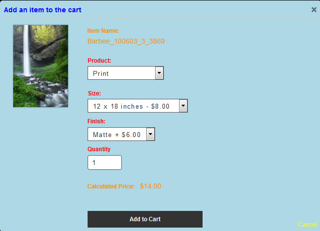
Note: the disappearing text issue has been resolved with the Cart 3.1.4 update. There’s a tiny quirk with the TTG Add to Cart dialog box. Some of the styling comes from a file named modal.css (from ttg-be/cart/lib/css/) and some of it comes directly from the style-common.css file of the gallery from which your clients are […]
Using CSS filters for thumbnail hover effects in your TTG Galleries
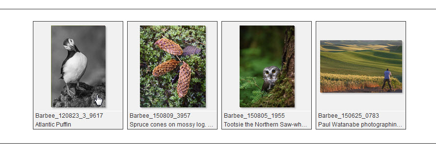
Use CSS filters to add hover affects to your gallery thumbnails.
Cell Numbers and grid icons in CE4 CRG albums and galleries

If you’re using CE4 CRG you’ll run into a conflict if you’re using Cell Numbers in the grid. What happens is that the Feedback and Download icons are placed in the lower left of the cell, the same place that the Cell Number appears. There are a couple of solutions to this. One solution is […]
Add border and shadow to your ttg blog featured images
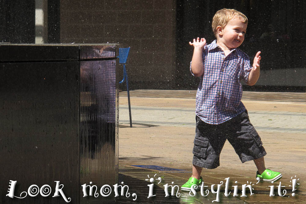
You may or may not know that you can easily add a border and drop shadow to post images. But those don’t apply to your post’s Featured Image. Here’s how to apply that same styling to the Featured Image.
Adding borders and shadows to images in WordPress
I recently posted about classes you could use in TTG text blocks to place and style images. Two of those classes are “border” and “shadow.” This post is about adding borders and shadows to images in WordPress. And it’s really as simple as adding one or two words to the Image Details dialog box. In […]
Add some holiday cheer to your site with custom css
Add some animated holiday bells to your TTG site
Dynamic Mastheads in CE4
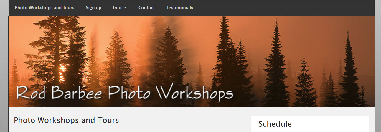
In case you’ve been wondering about how to employ dynamic mastheads in CE4 based sites, wonder no more. First, what’s a dynamic masthead? It’s a masthead that will adjust to the size of the browser width so that it looks good no matter the device. If you use a graphic logo for your masthead, when […]
Centering your mobile menu icon

Here’s a quick tip for those wanting to center their collapsed menu icon on mobile devices. When using mobile devices, your navigation menu collapses to a mobile friendly size and an icon with three horizontal lines appear on the left side of where your navigation once was. Click on this icon and the mobile navigation […]
